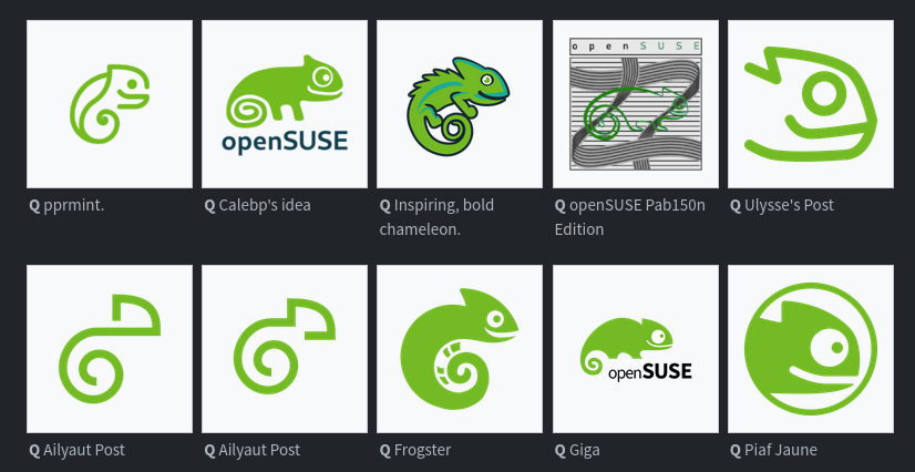
The openSUSE community’s logo contest submission phase is now complete and voting for the logos has begun.
This competition marks a pivotal moment for openSUSE and the voting goes until Dec. 10.
Before making any selections, people are encouraged to visit en.opensuse.org/Logocontest and view the logos before voting.
The number of submissions speaks volumes about the community’s enthusiasm and engagement with 18 submissions for Kalpa, 24 submissions for Slowroll, 21 submissions for Leap, 32 submissions for Tumbleweed and an impressive 36 submissions for a potential new openSUSE logo.
Bottom row, 2nd from the left. Simple, clean, distinct.
Aliyaut’s logo? It is clean, but it’s hardly even identifiable as a gecko. It blends in too much with all the modern corporate logos we have today IMHO. It’s not a bad choice if they decide to go with it, but they could do better.
Does the order get shuffled each time?

Ailyaut must be a debian fan :)
No
In the thumbnail?
Agreed, it really stands apart from all the rest.
Even from the one right next to it that looks almost identical??
These are two variations from the same artist.
Especially that one.
In my opinion one of the full design themes should be picked because some of those single designs look very nice individually but would clash with others.
My pick would be Emiliano’s theme, it looks the most like an evolution of the opensuse style. Imo the others are either a bit too minimalist or deviate too strongly from the original design.
Nikolayan’s design is also good, but I prefer Emiliano’s because that you can recognise the chameleon better in every logo.
Please not another ultra minimal mono color logo
I don’t feel like they’re inherently bad, but they’ve become so popular that they all feel like they’re blending together. I think it’s kind of stale at this point.
Too bad for you, they already have the logos for some of the variants and that’s exactly what they’re going for.

Yeah felt very obvious which ones will be chosen regardless of the survey…
Agony


